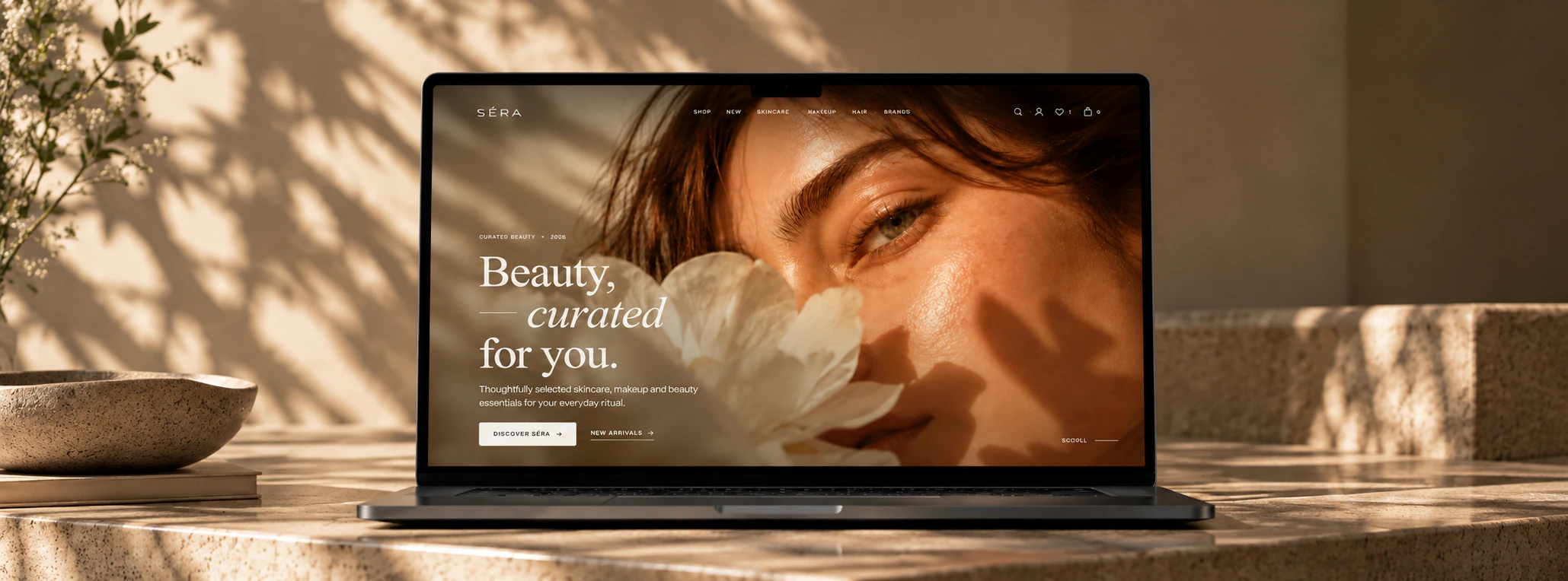
SÉRA
A multi-brand cosmetics and beauty store with a full e-commerce ecosystem behind it
- Client
- SÉRA
- Project type
- Online store
- What we did
- UX/UI design, development, responsive build
- Scope
- A full e-commerce ecosystem
01
About the project
SÉRA is a multi-brand beauty store where skincare, makeup, hair and fragrance are brought together into one coherent system.
The task was not a handsome shop window but a large, complete online store, one a visitor can walk end to end: from the first look at the brand and the search for the right product to building a routine of their own, saving things to a wishlist, placing an order and managing it from their account.
All of it had to stay visually light and premium, with a great many products, pages, filters and flows behind it.
02
The goals
- 02.01A recognisable premium beauty identity, without the look of a marketplace.
- 02.02A scalable commerce structure for a great many categories, brands and products.
- 02.03A catalogue that is simple to move through: categories, filters, sorting, search, concerns and edits.
- 02.04A full product page: specifications, ingredients, reviews, rating, recommendations and what goes with it.
- 02.05The whole route through: search → choice → wishlist / bag → checkout → account.
- 02.06Tools that help a visitor choose rather than merely browse — the routine builder, edits, bestsellers, new arrivals and categories by concern.
- 02.07A complete responsive system for desktop, tablet and phone, with nothing lost on the way down.
- 02.08One design system across a large number of pages, components and interface states.
03
The solution
SÉRA was built where premium editorial aesthetics meet the machinery of a large shop.
The design rests on large type, a warm neutral palette, photography, a great deal of air and a thin system of rules and dividers. It is why pages carrying a lot of information never look loaded.
The catalogue is a scalable system: the visitor moves between skincare, makeup, hair and fragrance, through the brands, the bestsellers, the new arrivals and the products for a particular concern.
The product experience got its own attention. A product page does not end at a photograph and an Add to bag button: it carries the ingredients, the key benefits, the rating, reviews with photographs, recommendations, what to pair it with and how it is used.
Around it sits a full account system, the wishlist, the bag, the search, the filters and the service pages.
04
What was done
- 04.01The whole commerce structure — home, catalogue, categories, new arrivals, bestsellers, sale, brands, brand pages, product pages and themed edits.
- 04.02Catalogue and navigation — filtering, sorting, categories, search across products and brands, navigation by skincare concern and quick ways into the main parts of the shop.
- 04.03Product pages — gallery, price, variants, specifications, the full ingredients, the key benefits, rating, reviews, customers' photographs, pair-with recommendations and related products.
- 04.04A reviews system — the rating, the distribution of scores, sorting, pagination, verified purchase, photographs inside reviews and a dialogue of its own for writing one.
- 04.05The routine builder — an interactive flow that helps a visitor assemble a sequence of care and understand what each step is for.
- 04.06Wishlist, bag and account — saved products, the bag, quantities, recommendations, order history and the visitor’s own account.
- 04.07A search experience — an interface of its own with popular queries and search by concern, by brand and by product.
- 04.08A brand experience — pages for each brand with its history, its positioning, what defines it and what SÉRA carries of it.
- 04.09Service pages — FAQ, delivery, returns, contacts, about, privacy, terms, cookies and the rest, set in the same visual system as the shop.
- 04.10Auth and user flows — login, registration, the password flows and the routes through an account.
- 04.11The mobile experience — the menu, the catalogue, the categories, the product cards, the search, the bag, the account and the more involved interactive blocks each got a logic of their own on a phone.
- 04.12The design system — one set of type, spacing, grids, cards, divider lines, buttons, transitions and responsive behaviour across the whole shop.
- 04.13Motion and micro-interactions — soft fade-ins, transitions, hover and touch states, the brand marquee, drawers, dialogues and a light branded preloader.
05
The scale of it
SÉRA is not a set of handsome pages standing apart; it is one large connected system.
The catalogue, the product pages, the brands, the edits, the reviews, the search, the filters, the wishlist, the bag, the account, authentication, the routine builder, the informational and the legal pages — all of them were worked through.
Every key flow was adapted for desktop and for a phone, and the components were built so the shop can take on new brands, categories and products without breaking its visual system.
06
Desktop and mobile as one system
Being responsive here did not mean shrinking the desktop version.
Navigation, search, categories, filters, product cards, the account, the bag, the interactive blocks and the touch states were each worked out again for a phone.
The shop keeps everything it can do at any size of screen; what changes is the way the interface meets the hand using it.
07
Desktop and mobile as one system
Being responsive here did not mean shrinking the desktop version.
Navigation, search, categories, filters, product cards, the account, the bag, the interactive blocks and the touch states were each worked out again for a phone.
The shop keeps everything it can do at any size of screen; what changes is the way the interface meets the hand using it.
SÉRA shows how a large online store can stay clean, warm and recognisable while a complicated commerce system sits behind the simplicity.